<body><script type="text/javascript"> function setAttributeOnload(object, attribute, val) { if(window.addEventListener) { window.addEventListener('load', function(){ object[attribute] = val; }, false); } else { window.attachEvent('onload', function(){ object[attribute] = val; }); } } </script> <div id="navbar-iframe-container"></div> <script type="text/javascript" src="https://apis.google.com/js/platform.js"></script> <script type="text/javascript"> gapi.load("gapi.iframes:gapi.iframes.style.bubble", function() { if (gapi.iframes && gapi.iframes.getContext) { gapi.iframes.getContext().openChild({ url: 'https://www.blogger.com/navbar.g?targetBlogID\x3d38567581\x26blogName\x3dMy+Design+Blog\x26publishMode\x3dPUBLISH_MODE_BLOGSPOT\x26navbarType\x3dTAN\x26layoutType\x3dCLASSIC\x26searchRoot\x3dhttps://mydesignblog.blogspot.com/search\x26blogLocale\x3den_US\x26v\x3d2\x26homepageUrl\x3dhttps://mydesignblog.blogspot.com/\x26vt\x3d2499284756396259133', where: document.getElementById("navbar-iframe-container"), id: "navbar-iframe", messageHandlersFilter: gapi.iframes.CROSS_ORIGIN_IFRAMES_FILTER, messageHandlers: { 'blogger-ping': function() {} } }); } }); </script>

Google.com Hacked

Wednesday, January 24, 2007 by webmaster

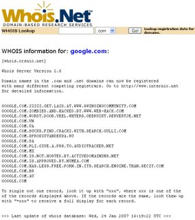
Looks like Google.com Whois has been hacked. Look here if you don't believe me.


Edit:

Google Whois isn't hacked. Thanks for sublime for clearing this up:
Google is not hacked, and not even "sort of". Whois has NOT been changed by hackers. Those entries at the top are not under Google's domain.
You can add as many subdomains as you want to a DNS entry. Digg could add google.com.digg.com. The WHOIS search is showing any domain AND SUBDOMAIN with google.com in the querystring.

Adsense Placement Tips

Saturday, January 13, 2007 by webmaster

Here are some little tips that will increase your Google Adsense CTR.

Tip 1: Image ads

Adsense made it clear that images next to Google Adsense ads are forbidden.
Can I place small images next to my Google ads?

We ask that publishers not line up images and ads in a way that suggests a relationship between the images and the ads. If your visitors believe that the images and the ads are directly associated, or that the advertiser is offering the exact item found in the neighboring image, they may click the ad expecting to find something that isn't actually being offered. That's not a good experience for users or advertisers.

Publishers should also be careful to avoid similar implementations that people could find misleading. For instance, if your site contains a directory of Flash games, you should not format the ads to mimic the game descriptions.

Source


The click through rate of many arcades and tutorial site when down because of this. When I was surfing at PhotoshopStar.com I saw a smart improvishment. The webmaster used two Adsense ads next together, one image ad and one text ad.

Tip 2: Don't draw attention to the 'Ads by Google'


Don't use the normal banner (468*60). Visitors will immediately read the 'Ads by Gooooogle' and ignore it.


Instead use a skyscraper or the 728*15 link unit. A good example is ProBlogger.com. Try to get the 'Ads by Google' outside the visitor focus point.

Tip 3: Imitate

Finding the perfect Adsense implementation needs lots of work. But why do it when others already have done it? Go to the Sitepoint Marketplace and search for websites with the same genre as yours. Calculate how much they make per 1000 unique visitors (not pageviews) and compare them. Pick the highest and look at their Adsense placements.

Tip 4: Ad unit or link unit

Know your genre of your website when you have to choose between an ad unit or a link unit. If your visitors surf the Internet a lot they know how to spot an Adsense ad. Link units are useless when it comes to hardcore internetters. When you run a tutorial website, you probally get these ads:
Ads by Google
Tutorials
Photoshop
PS tutorials
Adobe Tips
Photoshop Techniques
People who know these are Adsense ads, aren't interested in an ad just called 'Photoshop'. They want more info. It's really hard to get their attentions. You can use link units as a extra, but don't use it as the only ad.

Creative Advertisements

by webmaster

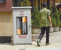
Here are some creative advertisements I really like. Good ads don't need explanation, so I won't give you any.


Some Good Photoshop Tutorials

Thursday, January 11, 2007 by webmaster

There are plenty Photoshop tutorials. But it's hard to find good ones. 90% of the tutorials are sphere and 'web 2.0' buttons tutorials. Here are some tutorials I find useful:

Andy Warhol tutorial
A great tutorial on how to make a Andy Warhol type of photo.

Pop art tutorial

The tutorial doesn't explain every step, so you need some experience with Photoshop.

Lomo Photography tutorial

I really like the outcome of this one. It's really good on urban themed pictures.